When it was time to develop a logo for the Kenneth Kam brand, I remember initially telling myself that designing it should be simple.
However, soon afterwards, I quickly realised that ‘simple’ couldn’t be further from the truth. The truth is, there’s much more to crafting a brand’s visual identity than just placing a name in a circle, splashing some fancy colours around it and calling it a day. In fact, some companies have been known to spend millions of dollars designing their corporate logos – and for good reason.
A logo is the ‘face’ of the brand, creating a first impression on clients and prospects. A logo encapsulates everything you want your brand to stand for. A logo also signifies a promise, constantly reminding me of why I do what I do.
I believe getting the right answer (or in this case, the right design) starts by asking the right questions.
How do I create a visual symbol that embodies who I am while showcasing the myriad of values integral to the Kenneth Kam brand? How do I communicate all of this in eight seconds or less, which is the average time it takes for a first impression to be made? And of course, how do I ensure it is aesthetically pleasing?
People often ask me about how I developed my visual identity. From initial conception to final completion, the experience was as equally challenging as it was rewarding. I was not only happy with the final outcome, but also more appreciative of the painstaking attention to detail and deep level of thought involved in the creative process.
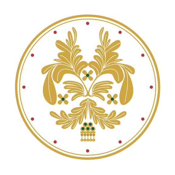
Starting with the big picture, the outer circle of my logo represents the circle of life, in the sense that I am constantly evolving. A circle teaches us that all things are interrelated and an equal part of the whole. Exemplifying this notion, the inner circle of 12 rubies represents the following 12 life principles of the Kenneth Kam brand:
Life Balance
Self-Awareness
Integrity
Never Assume
Give Value
Reliability
Inclusiveness
Resilience
Stay Focused
Prudence
Resourcefulness
Presence

Like the connotation of a circle, these 12 principles each play an equally important role in my own constant evolution.
The five emeralds encircled in gold represent my unyielding beliefs of being valiant, grateful, diligent, resilient and accountable. These beliefs are supported by my five core pillars of trust, worth, focus, ethics and inspiration. Together, the five emeralds and five pillars make up my foundation.
Stemming from these roots are three emeralds which stand for mindset mastery, namely Learning Mindset, Money Mindset and Lifestyle Mindset. These emeralds blossom gold petals, representing sustainable growth. And surrounding these blossoms are fractals which reflect the trading life. All in all, the symmetrical layout represents harmonious balance, which is key in my life.
Bringing all of these elements together, the logo resembles the patterns of the matador’s ‘suit of lights’ – the design’s main source of inspiration. The logo was also designed to be versatile enough to be used on a wide range of items such as watches, money clips, rings, tie bars and key rings, without compromising the quality in any way.
Chances are, creating a visual identity for yourself has never crossed your mind. But I believe it’s a strategic investment that can pay off in the long run. Especially in our fast-moving world where attention spans are shrinking and personal branding has become even more critical, a logo could very well be the difference between standing out from the crowd and getting lost in it.
Authored by Kenneth Kam
Produced by Callio Media
